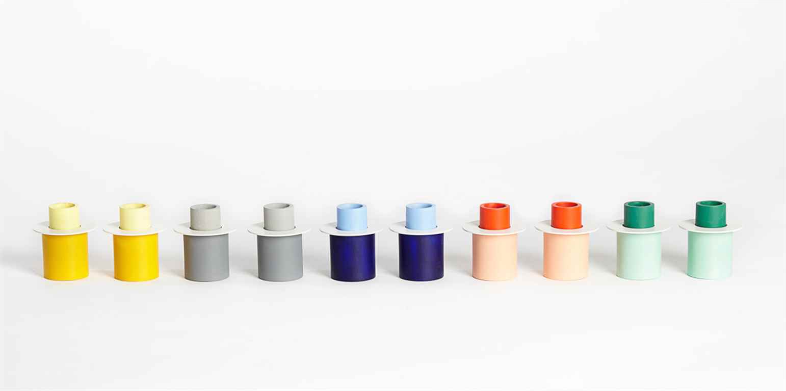
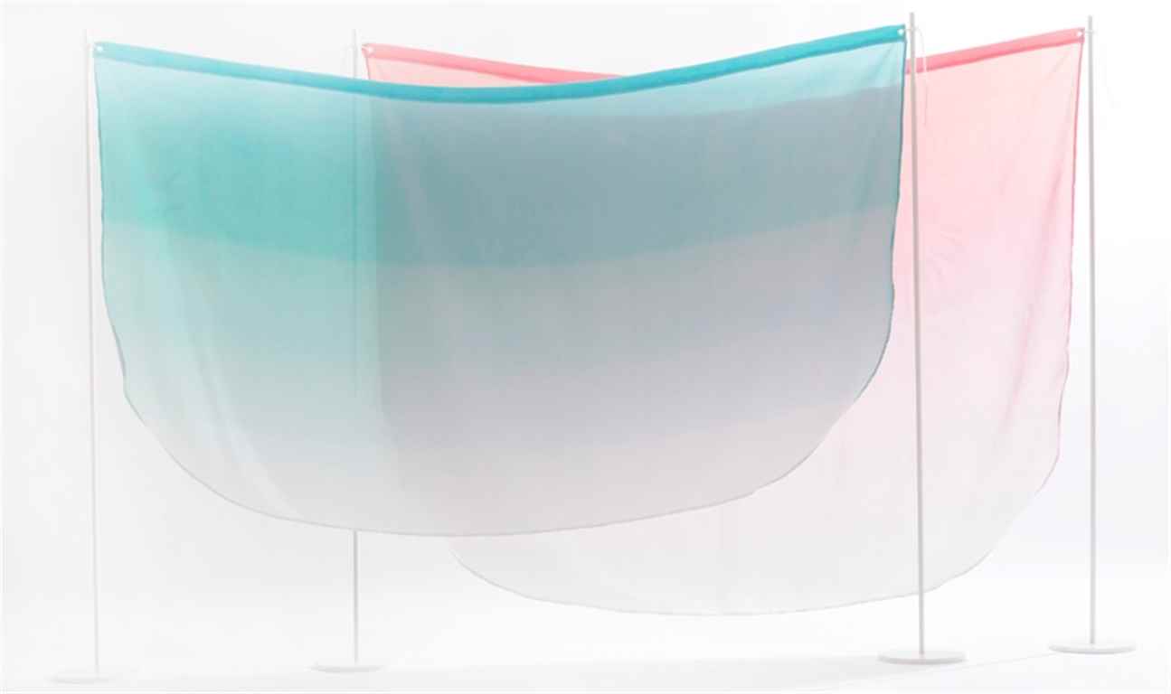
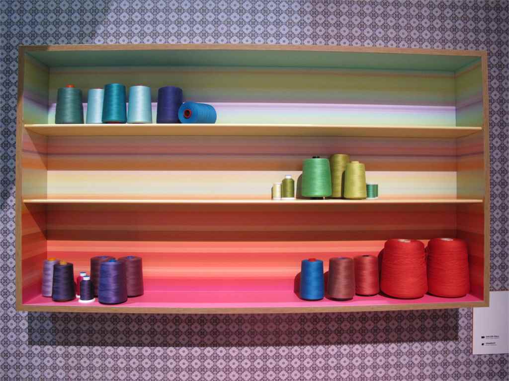
Hues and Tonal Proportions Colour-blocking treatments for function-focused homes and interiors goods are embracing sober, restrained use of colour that provides useful points of differentiation and interest without being brash. Here, we highlight how tonal variants are being harnessed for controlled and simplified aesthetics. Semi-saturated and pastel colours are combined with block saturates to create uplifting palettes used for furniture, home accessories and tableware. Components are differentiated using colour – the form and structure of small objects are emphasised using tonal variants, while soft neutrals break up the use of vibrant colours, resulting in colourful objects that are still calming.




Leave a Reply
You must be logged in to post a comment.